You can travel the world, wander unknown streets, searching for the exotic, or, you can stay in your own home and let the light guide you to something just as intriguing.
Along the Rio Grande
A River Runs Through It
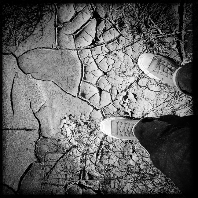
Those of us who live in New Mexico know the importance of the Rio Grande. One of its values is the wonderful, (mostly) undeveloped nature of the bosque that adorns its banks. The bosque offers a respite from the urban life of Albuquerque, and yet exists within minutes of the city itself. It's a thicket of salt cedar, fallen branches, various flowers and grasses, jetty jacks and the abundant cottonwood trees, which at this time of year, explode into yellow and gold. Today was a perfect, overcast day, so the wife and I headed out for a quick wander. Except for temporarily straying into an extremely muddy patch (as is evident in the photo of my destroyed Chuck Taylors) the day rewarded us with many sights and sounds. Of course, I decided to capture the glorious colors of autumn in black and white.
"Self and Shadow" near Cabezon Peak, New Mexico
Quo vadimus
I had the pleasure of taking a day-long road trip with my good friend Bob Ayre this past weekend. Bob knows New Mexico like the back of his hand, so it was a treat to let him guide me into uncharted territory in the northwest part of the state. My Fiat would never have survived some of the unpaved back roads we traversed, and I probably would have chickened out heading down some of the routes by myself. With Bob at the helm, I saw some difficult to reach locations for the first time. Here's a sample of our journey. Thank you, Bob.
Gratitude: God Is In The Details
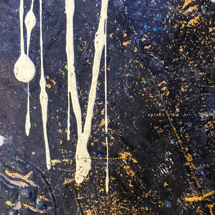
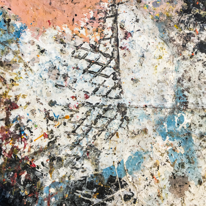
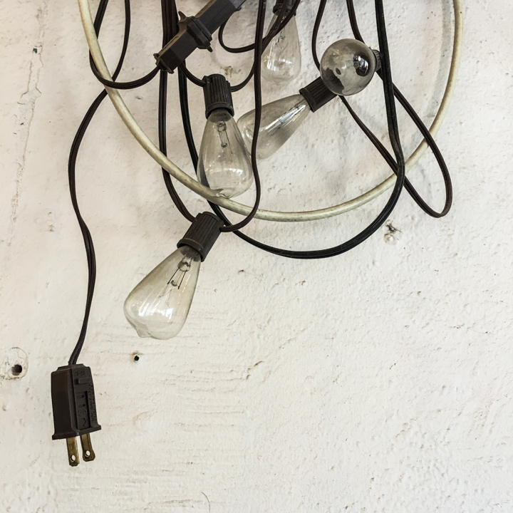
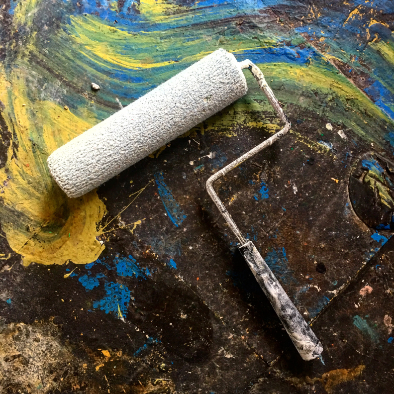
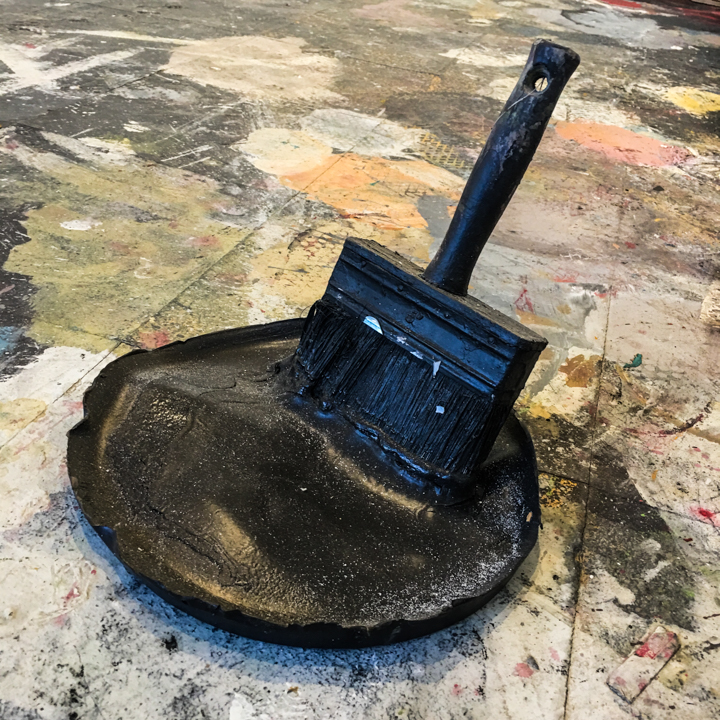
Many thanks to everyone who came by for my pop-up photo exhibit this weekend, and to those who purchased my zine or a framed print. I am grateful and humbled by your support and interest in my work. Extra special gratitude to Rocky Norton, a true artist and creative force of nature, for opening his studio space to me. While I had some time gallery-sitting, I was able to explore a bit of Rocky's world. They say God is in the details, and if so, he / she wears a coat of many colors.
Photograph © 1958 by Robert Frank
Worth A Thousand Words: Robert Frank
Up to this point, I’ve been hesitant to write any words about Robert Frank, for a number of reasons. Most of them are rooted in my deep love of his work and the profound influence he has had on my own image making. How do I pay due respect to an artist so important to me? Can I be objective when writing about a particular image of his? Another challenge would be deciding which of his images would I focus my attention on? There are just too many touchstone Robert Frank photographs to choose from. Nonetheless, with a looming exhibit of my own, it made sense to try to write about this week’s image “Covered Car, Long Beach, California.”
So, what do we see in this photograph? It is a car, covered in some kind of white fabric. The car is parked between two thick palm trees. Shadows from the trees are cast upon a plain looking, boxy building, the wall of which look covered in a dark stucco. The light seems like late afternoon to me. The composition is slightly off kilter, just slightly tilting to the right. The fabric that covers the car has an almost striped appearance to it, the result of bands that are stitched together. The contrast is somewhat stark, with the white of the cover offset by the deep shadows on the wall, and the tufts of palm leaves on the trees. All in all, a fairly non-complex photograph at first glance.
What is not seen in the photo? Well, this is an urban environment, but there are no people seen in the shot. And we of course assume there is a car under the tarp, being able to recognize the shape of the chassis, and the distinct poke of an antenna pushing up the covering as well. The next question I ask myself is why did Frank take this photo? It appears in his seminal book “The Americans” which creates a context for a deeper interpretation of the image. Frank explored the subject matter of the automobile extensively throughout the book. When Frank was shooting the photographs that eventually became "The Americans," the automobile was seen as a key component to the post-WW2 westward expansion in the United States, and was a symbol of freedom and mobility for a growing middle-class society. The fact that the car is covered brings what seems to me an elegiac quality; quite a mournful feeling to this image. Coupled with the fact that the lighting indicates late in the day, nearing sunset, I get a distinct feeling that there is an intrinsic sadness to this image. The car becomes a body covered, something to be mourned, hidden, and prepared for some kind of death. Of course, this is my personal projection on to the image, but if an astute viewer were to look at the photo in the context of where it appears in “The Americans” one would make a similar leap.
The image appears in a sequence of the book that begins with a close up, side view of two men in the front seat of a car, “US 91, leaving Blackfoot, Idaho.” Here we see the car as a means of escape, with Frank a passenger in a very tight front seat with two mean who look as though the are fleeing a crime scene. Next is an image of five elderly people sitting on a roadside bench, titled “St. Petersburg, Florida.” In the background, we see a car speeding by, slightly blurred. Is this a rumination on death, the life that is soon to be leaving these people speeding behind them as they wait for the inevitable? The “covered car” photo is the next image in the sequence. The photo that then immediately follows shows the aftermath of a car accident, with a group of four people standing beside the blanket covered remains of what is surely a dead body. The covered body echoing the covered par in the previous image. To complete this run of images, we see a long view of a lonely highway in New Mexico, stretching off into the far distance, with just a lone car driving towards us, seen very far off in a dark, foreboding environment, under a threatening sky. Seen as a whole, this sequence of images tells a sad story of life and death intertwined with the presence or influence of the automobile.
Photograph © 1958 by Robert Frank
My own fascination with covered cars stems directly from the image made by Robert Frank. My approach to the subject matter is quite different. For one, I chose to show the cars in color. I have taken a clinical, studied approach to the subject matter, and have assembled well over fifty of such images, to date. I am fascinated when I look at them as a group of photos, when the variety of covers and locations become a foil to the consistency of the subjects. Yet, there is still that initial feeling of sadness that permeates the images I make. These vehicles are covered for reasons I don’t ever really know. Are they classic cars that require protection from the elements? Are the windows busted and leaking, requiring covering to protect the interior? Is the vehicle evidence of some crime? Has an accident occurred? They often look like Christ-like bodies, covered in shrouds. Or perhaps they represent something desirable yet hidden from view, their covering providing a layer of mystery and intrigue.
It is amazing to me that so many of these covered cars reveal themselves to me as I travel my home city, but also in locations that I travel to. They seem to be everywhere once I start looking for them. They serve as a constant reminder of the influence that Robert Frank has had on my work, and send a silent message of kinship and solidarity to me as I pursue my work. As the master has said, “The eye should learn to listen before it looks.” I am constantly listening and looking, too.
Addendum: I recently recorded a podcast about Robert Frank. Give it a listen!
Beyond Words, Beyond Expectations
Sometimes it takes a while to realize that you have made a good choice in your life's direction. Over two years ago, I decided to take my personal photography more seriously. One thing that I always dreamed of doing, but never had the guts to attempt, was an artist residency. So, in early 2015, I mustered the courage to apply for an opportunity to spend a month in the city of Porto, Portugal. My focus on Portugal was partly due to my connection with fellow photographer, Fabio Miguel Roque. He is based in Sintra, just outside of the capital of Lisbon. We are both members of the Latent Image Collective, and though we had never met in person, I was excited to finally connect and spend some time shooting together. Long story short, I was invited for a residency at De Liceiras 18, and spent a month focussing on my personal photographic work. I also spent two days shooting with Fábio, and our creative bonds deepened as a result.
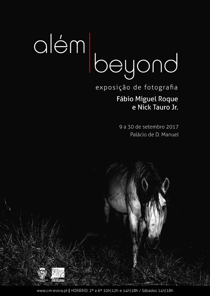
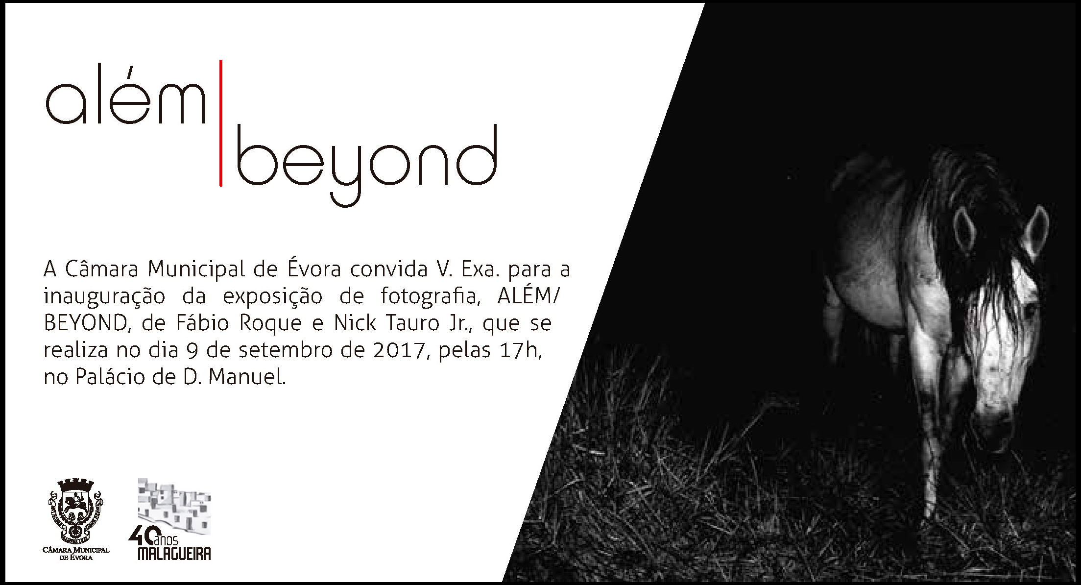
Fast forward to October 2016. Fábio and I were looking for a project to collaborate on long-distance. We devised a plan to shoot simultaneously for 24 hours, each of us taking a solo, photographic road trip, each wandering without a set plan into the desert near our homes. We would share the results of the trip in a joint publication. We released the book "Beyond / Além" last year, and hoped that we could one day exhibit the work. That hope will be realized this weekend in Évora, Portugal.
I am so thrilled to be able to share the walls of a gallery with my friend and collaborator, and it stands as a tangible manifestation of the idea we had months ago. What is even more meaningful to me is that first step I took outside of my comfort zone, the decision to travel to Portugal in the first place, has reaped so many benefits for me personally and creatively.
The show opens this Saturday at the Palácio de D. Manuel in Évora. I received the text from the program, that was written by Eduardo Luciano, Councilor for Culture of the Municipality of Évora. I'd like to share it here, as it is an insightful analysis of the work that Fábio and I created. I am honored and humbled by these words.
“Only art could unite two realities that are two thousand kilometers away, and yet they feel so close. From these images we can perceive that the ocean that separates is, above all, the ocean that also unites us, just as the bridge that we share may be the element we need to overcome and to reach the other. The aridity, the loneliness, the paths that the work of these two photographers explore, seem to go nowhere. Yet, there have the common features: the existence of humans, both in the American desert and in the Alentejo. We look at the two realities from a point so far and yet so close, via the sensitivity of these two artists.
This exhibition is a challenge of reading reality, above prejudices and against prejudices. In a world where the unknown is the engine of our fear and in which there is a growing temptation to mortgage freedom on behalf of a false security, Fábio Miguel Roque and Nick Tauro Jr. show us, in an impressive way, the deep similarities that bind us.
The Municipality of Évora could not fail to accept and promote this universalist approach to space, as it explores the aesthetic convergence of two naturally divergent environments. It is our duty, as a public service, to promote unrest, stave off the doldrums, question certainties, and discuss the unknown. Without fear and knowing that the “invisible city”, that Italo Calvino brilliantly put into the words of Marco Polo, it will be whenever our imagination allows.
Welcome to the journey, welcome to the paths that lead us to the “other” landscape. So that the difficulty of finding it is not as difficult as José Samarago enunciated in his speech before accepting the Nobel Prize, “one arrives more easily at Mars than at our own fellow human.” Perhaps art is the map that enables the trip to the universe of the other, and is more pleasant and shorter than the hypothetical arrival to Mars.”
Click on the images above to see the program from the exhibit.
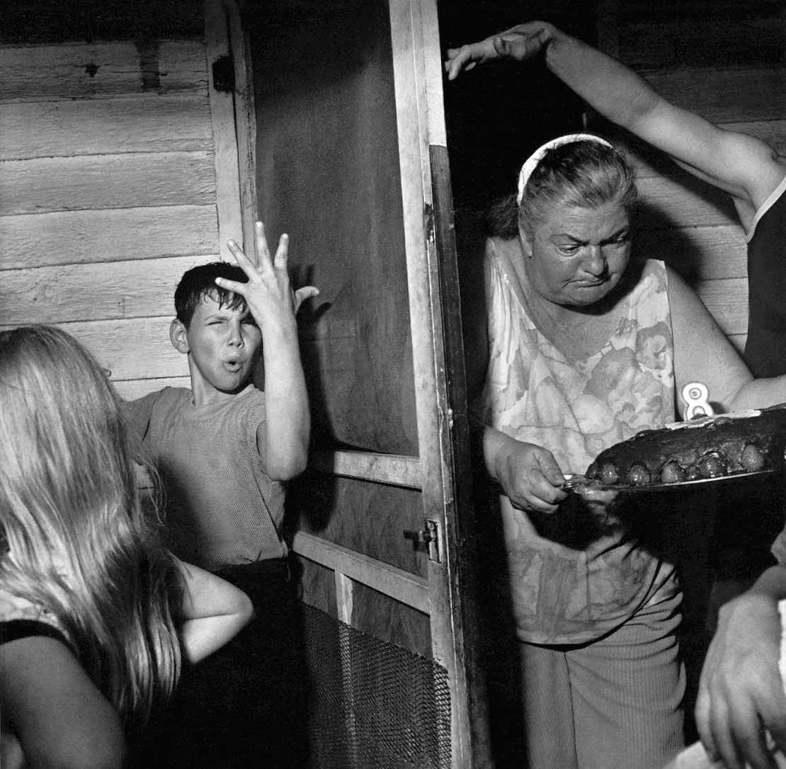
Photo © Larry Fink
Worth A Thousand Words: Larry Fink
Red state or blue state. Rich or poor. Rural or urban. Black or white… or red… or brown… or yellow. Republican or Democrat. Educated or uneducated. Liberal or conservative. Hopeful or hopeless. There are many divisions in the United States right now, not to mention the world. There are maybe more things that divide us than unite us, I suppose, depending if one is an optimist or a pessimist. Yet another divide. I ponder these things on a regular basis; certainly when I read the news over breakfast every morning. I ponder these things as I look at this week’s photograph, “Pat Sabatine’s 8th Birthday Party” by Larry Fink. Though the image was produced in 1977, I think looking at it through a contemporary eye brings an even deeper appreciation to it for me.
Larry Fink is an enormously talented photographer, whose work hangs in many museums around the world. He has also published many important photo books. This particular photograph is the cover image from his book titled “Social Graces.” That book will probably remain his most important body of work, for many years to come. The images are a stark contrast in subject matter: either the lives of wealthy New Yorkers leading glamorous lives, or working-class folks in rural Pennsylvania, leading a much less glamorous existence. Though the pictures are of two very different worlds, it is Fink’s technical approach and intimacy in each environment that truly unifies the body of work. The photographer enables the viewer to be a voyeur into world’s that are most likely quite different, perhaps completely alien from their own.
Fink shows the very rich and the very poor using a stark lighting technique, the result of a bright flash in a mostly under-lit environment. The photographer has likened his approach to the same way Rembrandt would like his subjects. It is interesting to have the lighting add a feeling of “uncovering” to the images. Especially when the photos depict the lives of the very wealthy, the lighting brings an arresting element of discovery to a world made exclusive to the most of us. These are photos of the “1%” before there was such a term.
It is the folks at the other end of the spectrum in Fink’s book that I find more compelling, though. This week’s subject image is case in point. What do I see in this image? It is a black and white photograph, square format, indicating that this was most likely shot with a medium format camera. Interesting to consider that Fink was operating in a tight space with a larger camera than a stealthy 35mm. The lighting is the result of a flash, as we see a wonderful wash of light, along with a number of shadows, that help create an even more dramatic play between black and white. The flash has frozen a moment that was in flux, and if I rest my eyes and my mind for a moment longer, I can start to hear, smell and feel the chaotic environment he is showing us. To me, it feels humid, there is shouting, and a creak of the wooden screen door. Before the image was made, there was probably a shout from inside by the older woman, carrying the birthday cake. “Can someone get that door open?” might have been heard over the din of the assembled family. I love the arm that arches over her head, the way the fingers gingerly hold the door open. It’s one of three hands that I’m fascinated by in this shot. The second is the resting hand in the lower right corner of the image, fingertips cut off by the framing, acting as both a pushing force to make way for the cake, while also anchoring the chaos within the picture frame. The last hand is obvious to all, that of the young boy near the center left of the photo. The flash has frozen him in the middle of what must be an outburst. His fingers are splayed out, and seem to be punctuating some kind of a shout, or by the look on his face, perhaps even yelp of confusion. His sweaty hair is matted to his forehead, his lips forming a round O, looking like he is hooting. The shadow of his arm falls on the screen of the door. The wonderful blond hair of the girl next to him falls in front of our eyes, resting, in part, on a bent elbow. Is it the boy’s birthday? Or the girl with her back to the camera? Hard to tell who the 8 year-old may be. But again, I could not only imaging the feeling of being there at that moment, but could also imagine the taste of that cake, with its rich chocolate frosting.
How can the viewer not feel like a voyeur when looking at this image? Fink has gained us access to a world that might very well be unfamiliar to us. And his use of the flash seems to have stolen a moment that would have not been visible otherwise. But what is it about this image that speaks to me today? Going back to my original pondering of the divisions in this country, I think this photo exemplifies a world that still exists in many rural communities today. If the rich have gotten richer, the poor have certainly gotten poorer. The middle class, of which I am a member, probably doesn’t see or fully understand the lives on the very top or the very bottom. The rich have the capacity to control public access to their worlds, no doubt. But what does an urbanite living in Brooklyn, Venice Beach, or even Albuquerque truly know about those living in rural West Virginia, or somewhere in the deep south, or in rural Pennsylvania? We have our preconceptions and biases that paint a picture of how we “think” others live, but what do we really know? Do we get our impressions justified by 24-hour news channels, from reality TV shows, from dubious online sources? Do we really see each other as we pass on the street? Do we see each other at the mall, at church, at a sporting event? Do we know how others suffer? Do we know how they celebrate? Are we so different from each other? Does the distribution of wealth, the ravages of a capitalist system that creates winners and losers really speak to who we really are as human beings? I don’t have answers, but when I look at the work of Larry Fink, created over 30 plus years ago, I wonder. How does each one of us live our lives, accepting the lot we are given, or fight for something better for ourselves or our families?
Untitled (Bubble Gum, 1975) © Mark Cohen
Worth A Thousand Words: Mark Cohen
A lazy, late summer Sunday finds me back in my city of Albuquerque, hanging out in a coffee shop, sipping on an Aranciata Rossa and thinking about photography. I wandered through the Railyard Market earlier, and was struck by the capacity for Albuquerque to embody both the feel of a small town yet have the pulse of a much larger city. Running into fellow local photographers and artists, as well as aging scenesters from my former days in the music world, made me appreciate the benefits of living away from the coasts, away from the hustle of really-big cities, especially New York, which always loomed just over the horizon when I was growing up in New Jersey.
You may wonder what the relevance this has to my weekly exploration of one photograph / one photographer. Perhaps it is serendipitous that I decided to focus on the work of Mark Cohen today. For those of you who are not familiar with the man or his work, he is one of the unsung heroes of street photography, creating stunning images for well over 40 years. What is certainly a point worth noting is that he has built his career in Wilkes-Barre, Pennsylvania. Staying outside of the center of the art / photography world that is New York has perhaps kept him somewhat off-the-radar, and thus, perhaps limited his exposure to a wider audience. Nonetheless, his work is powerful, jarring, sometime surreal even, and on par with that of his contemporaries that have enjoyed greater critical acclaim and popular recognition.
The image I am looking at today is probably the first image I saw of Mark Cohen’s work. Formally an untitled work, it is sometime called “Bubble Gum” and dates from 1975. There is so much energy in this image, and at the same time, so much mystery. Let’s take a closer look. We see a black and white photograph. The subjects are illuminated by a flash unit, most likely hand held, slightly off camera, based on the position of the highlights. The use of the flash is key here, as it not only lights the scene, but also stopped the action, that looks as though it was in flux during the shoot. There is evidence of a slightly blur as the lighting falls off of the hand in the top /middle of the frame, and the background utility pole and buildings also show a blurriness. What draws me to this image is the strange geometry it presents. The way the bubble sits along the bottom of the frame, while the side of the face and hair lurk just behind, the hand of another person creeps up through the middle of the frame, and the dreary looking urban environment that falls of into the distance creates a formality to the photograph as it pushes the viewer’s eyes back toward the action in the middle.
There is a strong, subconscious element at play in this image, and acting as an armchair photo critic / psychoanalyst, I will delve deeper into what I’m seeing and feeling while looking at this image. The scene feels like it could be a still frame pulled from a movie of a dream. It certainly has a surreal quality to it. The use of the flash certainly heightens this feeling. I could imagine Cohen wandering through his town as night was falling, and coming upon a group of children, deciding to inflict himself into their world, their environment, with burst of light and a click of the shutter. The fact the we see no face behind the bubble adds to the anonymity of course, and when I see that hand above the head, it brings me back to the “Paul is Dead” rumors that swirled around the Beatles during their release of Sgt. Pepper’s, a hand above Paul’s head meant to signify “he was being blessed by a priest before being interred.” Though my shrink might have other interpretations, that is a potent symbolism for my reading of this image. I could also make an assumption that the hand is in the process of coming down hard on the figure blowing the bubble. Could it be the action of an over-zealous, over-physical friend or sibling trying to burst the bubble? Or it could be simply someone trying to get themselves into the photo.
If one explores more of Mark Cohen’s extensive body of work, you would see that he uses this faceless, tightly cropped approach in much of his work. The disjointed, faceless limbs, chests, knees and hands that appear again and again, often covey a feeling of violence, of invasion, of latent sexuality and of a breaking down of the barriers of personal space. I have seen videos of Cohen photographing, and he employs a similar technique to that of Bruce Gilden, where he often surprises his subject with a flash and a thrust of the camera while they are strolling along, minding their own business. The fact that Cohen often photographs children or teens probably causes him more trouble in a small town. Shooting on the streets of Wilkes-Barre would most likely make Cohen a more obvious presence than a photographer blending into the masses of humanity on the streets of New York City.
Which brings me back to my opening point. I must add additional praise to the work of Mark Cohen, strictly because of the environment that he chooses to work in. I feel an affinity with those photographers working and creating away from the east and west coasts, and those who are toiling away in what may be a deeper obscurity because of it. It is also a challenge to blend in when you are wandering with a camera in a less populated area, for sure. But there is also a great freedom that comes to those who work away from the spotlight. It may bring the development of a style that is more dependent on what is in the mind of the photographer and less about what complexity might linger in front of his or her lens.
From the series "The American Monument" © Lee Friedlander
Worth A Thousand Words: Lee Friedlander
Well, I ended up taking a week off since I was on vacation, after all. But I’m jumping back into my routine, and thought I’d find an image that had some added significance to discuss. This week, I’m looking at a photograph by one of the most influential American photographers of the past 50 years, Lee Friedlander. His work has been instrumental in the development of my own style, and I continue to be inspired by his ongoing visual explorations.
The photograph I’m looking at today is from Friedlander’s series “The American Monument.” It is with intention that I am looking at this body of work now, against the backdrop of the vocal and sometimes violent re-examination of the presence and the meaning of statues and monuments that stand in cities across the United States.
This particular monument that Friedlander photographed, stands in what might be considered the “center of the world,” New York City. So, what is it that I see? It is a black and white photograph, shot on film, which is obvious when it is revealed that the image dates from the 1970s. Though the angle seems, slightly wide, the depth of field is sharp throughout, and the background stacks layer upon layer around the main subject, a statue of one “Father Duffy.”
Some cursory searching online found this information:
“Father Francis Duffy of Most Holy Trinity Church on 42nd Street near Broadway served with the Fighting 69th, a mostly-Irish regiment in World War I, was severely wounded, and received the Distinguished Service Cross for bravery on the battlefield. His monument in Duffy Square, the triangle formed by Broadway, 7th Avenue and 47th Street and dedicated in 1937, features Father Duffy in his World War I uniform standing in front of the Celtic cross.”
The location of the statue is part of Times Square, and it is interesting to see how much has grown around it, not only when Friedlander took his photograph, but as it looks today. Part of what I find fascinating about “The American Monument” series is that many of the featured monuments that have receded into their surroundings. Often, they look as though they have been neglected or forgotten. They become lost in their environments, or perhaps those environments have changed and transformed from when the statues were first erected. The Father Duffy image is a perfect illustration of this. If we examine how Friedlander chose to show us this scene, we can see that the statue is only one small component of the entire scene. The composition is almost like a jigsaw puzzle, with the image of Father Duffy lost in a sea of advertisements, block letters, scaffolding, and buildings. The alignment at the top of the frame is slightly off kilter, due to the perspective of the photographer looking up from ground level, while the wrought iron spikes of a fence along the bottom of the frame brings a jagged severity composition.
I find it interesting to ponder the fact that the monument we see in this photograph is a tribute to both a priest and a soldier. It brings a deeper meaning to the image for me. The symbolism of a spiritual leader is at odds with the crass consumerism on display around him. Secondly, the man who is lionized here was a soldier in World War 1, and his efforts to fight for his country were perhaps ironically resulting in giving us our freedom to drink an endless supply Coca Cola while waiting in line for some half-priced Broadway show tickets. The clash of reverence and irreverence is palpable. What is also quite interesting is once a Google image search is done on this monument, you can plainly see that the environment that Friedlander captured in the 1970s has changed dramatically to what one finds there today. Times Square was always considered the crossroads of the world, so any change really should not be surprising. As the area transformed under Rudy Giuliani in the 1990s, the real estate value increased at an unbelievable pace. Considering all of this, I am actually a bit surprised the statue wasn’t relocated somewhere else.
A recent photo of Father Duffy Square.
I wonder what Friedlander might add to the current national dialogue (arguments) about the role of statues and monuments in our country. As stated earlier, the overall feeling of the body of work is one of neglect or ignorance. However, we as a society are in the process of re-assessing who is considered a hero and who is a scoundrel, a murderer, or a traitor. Every monument is a commemoration of both a victory and a defeat. Both the conqueror and the conquered. If history is written by the victors, these statues, of course, focus on the exploits that have no doubt caused someone else great pain and suffering. From a nationalistic standpoint, it may be easier to hail a hero from a war overseas, and let the benefit of time polish the luster of the monument. However, when those commemorated have inflicted bloodshed on our own soil, against our own citizens, should these statues be allowed to stand any longer?
Perhaps Friedlander would choose not to overtly politicize his intent. To further your pondering, I will close with a wonderful quote I found by John Szarkowski on this work:
“… I think we are moved more deeply by Friedlander's intuitions concerning the nature of America's relationship to its past, concerning the vernacular materials out of which with attention we might fashion a culture, concerning the evidence of these countless attempts to preserve and nourish the idea of community. I am still astonished and heartened by the deep affection in those pictures, by the photographer's tolerant equanimity in the face of the facts, by the generosity of spirit, the freedom from pomposity and rhetoric. One might call this work an act of high artistic patriotism, an achievement that might help us reclaim that work from ideologues and expediters. His work, in sum, constitutes a conversation among the symbols that we live among and that to some degree we live by.”
Worth A Thousand Words: William Klein
photo © William Kein, 1959.
I am in transit as I write this, on my way to the East Coast for some family time and some much-needed beach time. That doesn’t excuse me from my weekly photo criticism exercise. If anything, I think it will bring an additional degree of insight to this week’s image. This week I will be looking at a photograph by one of the true masters of twentieth century photography, William Klein. As always, if you have any questions or comments, please don’t hesitate to leave a comment at the end of this entry.
A little of the backstory on Klein is appropriate, to start. Though he is American-born, William Klein is best known as a French photographer, having been living in Paris since he was stationed there by the US Army. He attended the Sorbonne in 1948, and though he originally was a painter, it was his filmmaking and photography that brought him great acclaim. His notable photo work ranges from groundbreaking fashion work, particularly his shooting for Vogue in the 1950s, as well as his highly influential book of photographs “New York” from 1954. If there is a style of his that I am most drawn to, it is this work, scenes of street life…frenetic and chaotic, highly contrasted and grainy. Klein has produced a series of books that crucial contributions to the art form, in addition to “New York” he has focused on Paris, Rome, Tokyo, and most notable to this critique, Moscow.
The photograph I’m writing about is a wonderful study in the contrast of emotions, while also being a textbook example of compositional intent. So, what do I see? It is a black and white photograph, with three people fairly-evenly distributed in the frame. It looks as though this photo was taken in the summer, perhaps at a resort, near a lake or a forest, judging by the environment. In the far background is an older, heavy set woman, who looks to be drying off on a park bench. In the middle of the frame, we see an older gentleman, sitting in a beach chair. In the foreground is a young woman, a broad grin on her face, her body slightly hunched over, leaning in towards the photographer. Each person is separated from the others by a strong, vertical element: a pole or a tree. Let’s take a closer look at each of these individuals, and how they relate to each other.
The woman in the far background is looking towards the camera, aware of the photographer, but she is somewhat out of focus, so her expression is a bit hard to judge. However, I believe her presence helps bring additional tension to the photograph. We can then shift our gaze to the older man in the center of the image. He looks as though he might be asleep, or at least dozing off. I wonder if he was at all aware of the photographer. Did he close his eyes and bring his hand to his face as a reaction to Klein’s presence? Is the presence of the young woman affecting him at all? Or, as I said, perhaps he is asleep, and lost in what may be a tense or disturbing dream.
If we now look closely at the young woman on the left, there is so much to explore and consider. She is the youngest person we see, by far. Is she somehow related to the other two? Are they her grandparents? She is a contrast to them in every way. She is vivacious, excited, and obviously fully aware that her picture is being taken. Her hair is stylish for the time-period, and her bathing suit is a bikini, which popularly swept the world in a fashion craze around this time. Some might judge her appearance a somewhat risqué for when the photo was taken, although the fact that she is young makes sense that she would be wearing a bikini, in comparison to the attire of her elders. Her bare shoulders lean forward, and her top looks to be hanging quite low. There is a fold of flesh along her tummy, accentuated by her lean towards the camera. The most compelling thing about her appearance though, to me eyes, is her mouth. Is she smiling at us? Is she grimacing? It seems her expression could fall somewhere between the two. Her teeth are even, but it is her gums that really grab my attention.
The image is dated in 1959, which is the first clue to a bit of deeper meaning, at least to American eyes. These were the days when the US and the Soviet Union were in full Cold War mode. The former WW2 allies were creeping further and further apart, with mutual suspicion ruling the mindset of each. While the 1950s, in the United States and most of the West, were seen as the heyday and triumph of a burgeoning youth culture, we were led to believe that the life of those living under communism in the east was subpar and stunted. Can this attitude help solve the intrigue surrounding this photograph then? We see a scene of a clear generation gap. The old ways giving way to a very different “new.” A young, stylish, bikini-clad woman, trying to express some freedom, some sexuality, while confined to the recreational world of her elders. We are peeking behind the “Iron Curtain” through the eyes of Mr. Klein. We are seeing a world, we probably misunderstood, at best, and were suspicious of, at worst. Yet, we see people no different than those probably vacationing in the shore of some American lake at the same time this photo was taken. We are more the same than we are different. Young people everywhere look to distinguish themselves from previous generations. Old folks shrug, shake their heads, when trying to understand the desires and interests of the younger generation. This is what I see when I gaze at this image.
As a footnote to this critique, I’d like to share a story. Once, in the late 1990s, while shopping in a Salvation Army thrift store on 23rd Street in New York City, I found a poster for a Klein exhibition in 1981. The poster features this same photograph. I framed it and it still hangs in my home office today, sitting right above my desk. I never tire of looking at it, and I continue to be inspired by the great work of William Klein.


