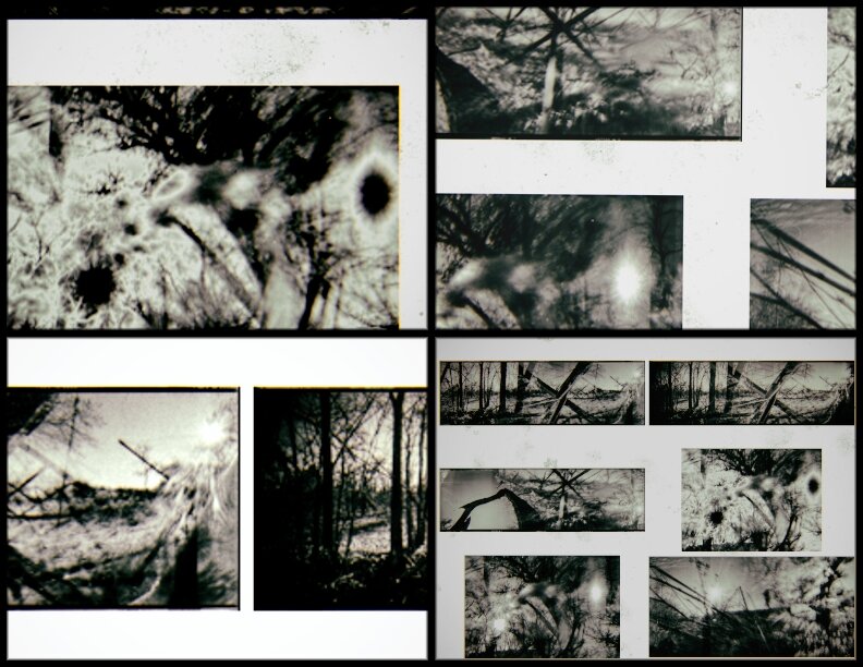
Hey there friends and followers! A quick note to let you know there is a new series on the website today. Click here or on ONE SIXTY SEVEN on the main page and check out my recent wandering in New York City, prism in hand.
Smoke and Mirrors
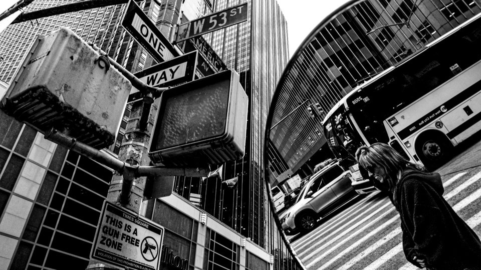
Another family obligation visit to New Jersey this week. Thankfully, I was able to carve out time for a visit into New York City. They say that it’s easier to photograph in NYC… there is certainly no shortage of subject matter, and the cacophony and chaos of the urban environment is a never ending sensory overload. That being said, I also find it challenging to make photographs that aren’t trite or cliche. It is a fine line between the best and the worst of “street” photography. I wanted my photos to have some unique character to them, so I brought along a pocket-sized mirror to play with while I shot. Pushing my lens up against the mirror allowed me to combine reflected scenery within the same frame as scenes directly in front of me. The juxtaposition of front and back merging into one exposure, for me, captures the complexity and energy of midtown Manhattan in a unique way. I’ve been toying with this approach for a little while now, but I now believe it is tailor made for the city streets. This might be the start of something new for my work. We’ll see if the novelty wears off, or if creative horizons broaden… reflected or otherwise.
2021: 25 Hold Still, Keep Going
Emerging from the pandemic lockdown has been an interesting challenge. Finding balance between the slow, quiet (albeit fearful) days of 2020, compared to the now open, now traveling, now meeting and working face to face reality… it’s definitely caused me some consternation. I don’t want to lose what I gained, but I also don’t want to live in a shell, away from the world. Case in point, I flew on an airplane last week to the east coast. I attended a large family gathering. I drank and ate and laughed and cried…with other people. I also spent a day in NYC, riding the subway (!), hanging out in Washington Square Park (!), eating a pastry in my favorite Italian bakery (!), and then jumping on another flight back to New Mexico. A few months ago this would have seemed impossible. Yet, here I am. I realize how privileged I am to write these words, to have experienced everything I have just described. Also, how lucky I am just to be alive, to have survived, not only the past year and a half, but also the decades before. I have turned inwards so much, it was good to step outside and feel the world around me once again. I hope for the same for all of you, whether it’s next week or next year. We are here, now. We may hold still for a moment (or months or years) but ultimately, we keep going.
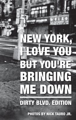
"New York, You're Bringing Me Down: Dirty Blvd. Edition" Free e-zine
Yesterday was my birthday, but today you get the gift. I've been playing around with the images from my most recent zine, and decided to do a "re-mix." I wanted to capture the dirt and muck of the streets of NYC, at least the way I remember them years ago. I had Lou Reed on my mind (and in my headphones) as I worked on these images, hence the edition name. As a way to say "thanks" to all of you for supporting my creative endeavors, I'm making my re-mix version available for free as an e-zine. Click on the image below for a look at the layout, and to download your own copy, gratis.
If you really like it and want to purchase a physical copy, I've set up sales on MagCloud.
Link to purchase is below.
New York, You're Bringing Me Down
Very excited to announce the release of my next zine. Those of you who know me, probably aren't surprised to hear that I have a love / hate relationship with New York City. This latest release takes a big bite of the Big Apple, "don't mind the maggots." The bright colors of photos are at odds with my attitude this time around. Nevertheless, I found the process of putting together this zine quite cathartic.
The zine is a 24 page, self-cover, perfect bound 5.5" x 8.5" booklet. Quantities are extremely limited, so don't delay, if you want one, grab a copy now. Available at my online shop.
Special shout out to Zé Manel Pinheiro at Photographic Mercadillo for first presenting this body of work. You can see the whole series on my website as well.
New York City: Photo Exhibit Overload
I'm fortunate that I have the opportunity to travel to New York City, usually once a year for a stretch of a week or more. One of my biggest dilemmas is deciding what camera to bring with me, as I always feel inspired to shoot while there. After that, it's always exciting to check the gallery and museum listings to see what photo exhibits might be on display during my visit. My most recent trip afforded me the chance to see five different exhibits, ranging from the work of a few titans of the art form, to a couple of surprises in unexpected places.
Henri Cartier-Bresson at ICP
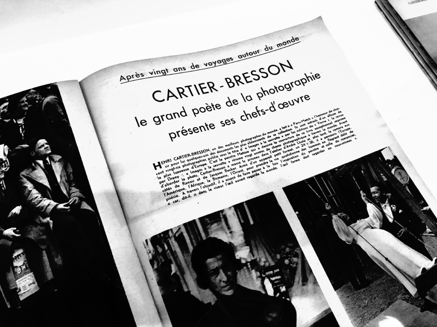
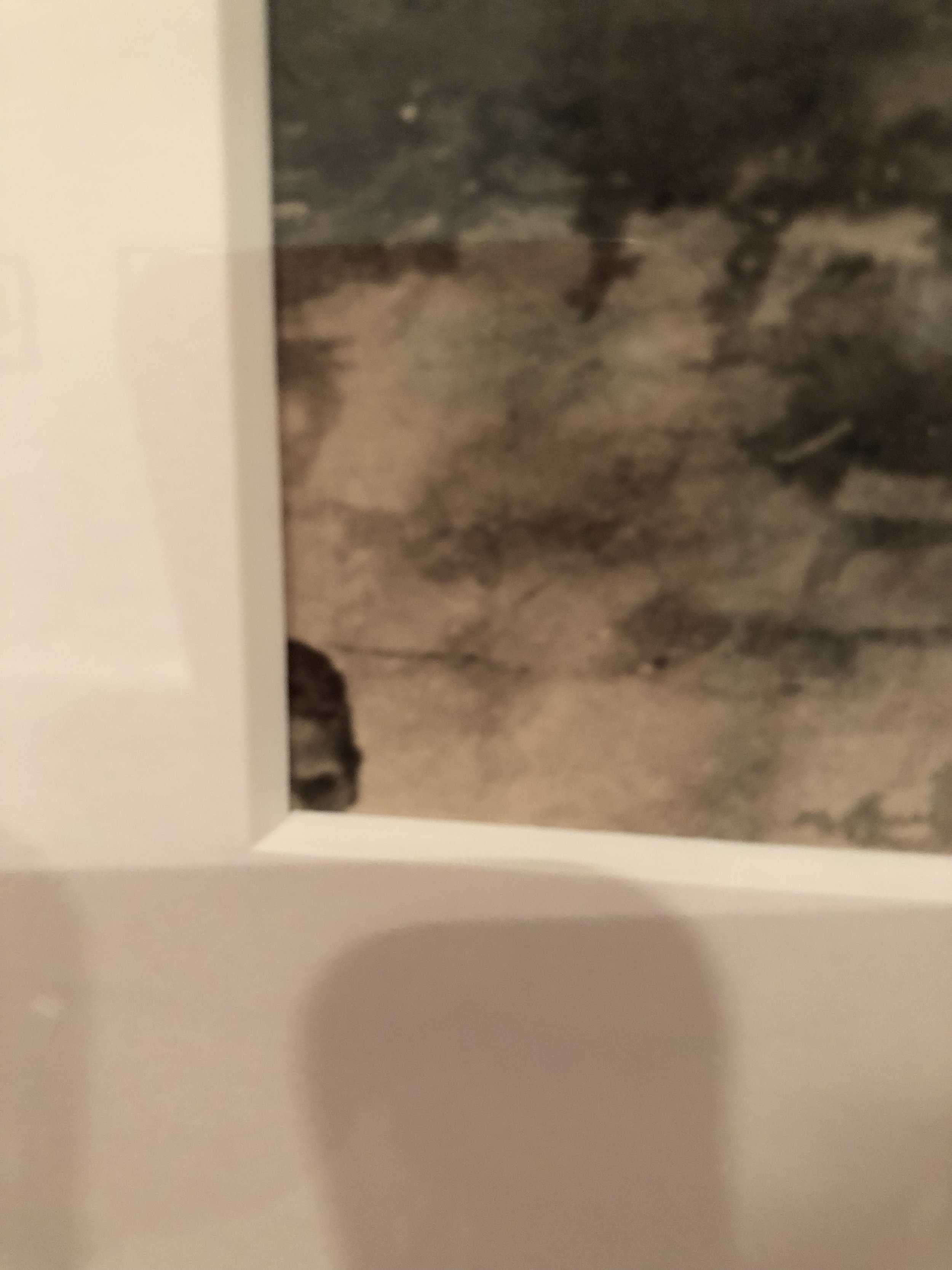
The International Center of Photography is a destination for me anytime I find myself in NYC, regardless of what they may be showing. I happened to arrive the day the Henri Cartier-Bresson "The Decisive Moment" exhibit opened to the public. Arriving just after the doors opened, I was rewarded with a near empty gallery, with plenty of time and space to explore the work. Of course, any photographer by now should know this famous body of work, or at least the concept behind "the decisive moment." What I found most intriguing was to revisit so many images I was familiar with, but haven't seen in a while. Time has only deepened my appreciation for this work. With the advent of social media, and the constant barrage of images, it is a testament to Cartier-Bresson that the photos are still remarkable in their energy, their timing, and their emotional impact. I was educational to see what he includes in the frame, as well as the serendipity that a fleeting moment provides. I wondered if the final images would appear differently had Cartier-Bresson had access to Photoshop, as the random appearance of a face in the corner of a frame, or a seemingly distracting element in the background does nothing to diminish the power of the whole image.
A face peeking out from a corner of a Henri Cartier-Bresson photo. No cloning tools back in the day.
William Eggleston at The Met
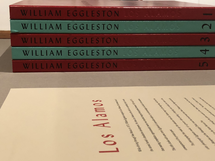
As luck would have it, I was in town with some time to view the William Eggleston "Los Alamos" exhibit at the Metropolitan Museum of Art. The chance to see the richly colored body of work from this American master was not to be missed. The series, which was produced in late 1960s to the early 1970s, had not been seen in this configuration at any museum in New York City before. The groundbreaking set of color photographs were surprisingly controversial when they first appeared, since at that time "serious" art photography was always seen in black and white. Color photos were seen as the realm of the amateur, relegated to family snapshots, or left to the world of commerce and advertising. Championed by John Szarkowski at MoMA, Eggleston pushed color photography toward acceptance and legitimacy.
The photos in the "Los Alamos" exhibit are Eggleston in his prime. Wandering mostly throughout Memphis and further into the Deep South of the United States, he compiled a series of images that both delight and confound. Color-wise, I can't think of anyone who would not be intoxicated by the deep hues that radiate off the walls of the gallery. What is most striking to me, though, is the profound sadness that permeates these photos. There is a pronounced streak of death and loss that resides in this work, perhaps it's just another manifestation of the tradition of "Southern Gothic" so present through the history of American art.
Eggleston at The Met
Stephen Shore at MoMA
Speaking of photographers who pushed color photography towards acceptance, The Museum of Modern Art had an excellent retrospective of the work of Stephen Shore. What I find most fascinating about the work of Shore is that it straddles the line between the vernacular photography of the everyday, and the conceptual, intellectual ground of the art world. He has always used the most common of means for his work, from the drugstore photo labs for his earliest color work, to his current embrace of Instagram and digital /print on demand publishers.
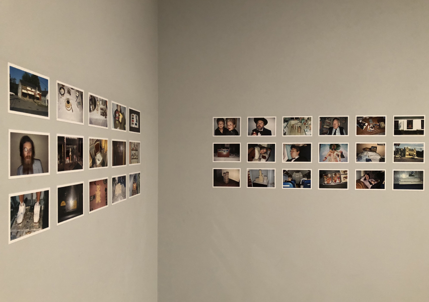
A section of "American Surfaces" on display at MoMA.
His early series of images, titled "American Surfaces" was created during a number of road trips across the United Sates in the late 1960s and early 1970s. The body of work is comprised of hundreds of snapshots Shore created and had developed and printed at inexpensive, consumer grade photo labs. I had seen this work published in a hardcover book years ago, but seeing it displayed on the walls of the museum, in the original manner Shore intended (row of small prints, running across an entire room) made me appreciate the full power of the set of photos. Part travelogue, part diary, part conceptual exploration of the mundane... the work is a reassessment of what one might consider "fine art" photography, and a rejection of the chasm between high and low art.
I was also excited to see a series of Shore's self-published photo book, interestingly displayed hanging from wires from the ceiling of the gallery. They are a great example of the removal of barriers to producing an immediate body of work, by using an online, digital printer to create the books. An inspiration to all of us who self-publish, and a testament to pursuing an idea quickly yet deeply.
Stephen Shore's self-published books, not exactly low hanging fruit.
Nobuyoshi Araki at The Museum of Sex
A ride on the subway on a rainy Sunday morning proved fortuitous, for while I was riding the Number 6 Uptown, I saw an advertisement for an exhibit at The Museum of Sex (stay with me here, people.) They were staging an exhibit by Japanese photographer, and all around force-of-nature, Nobuyoshi Araki. Though I was aware of some of his work, I was intrigued to see what kind of show might be going on at such a non-traditional venue for art.
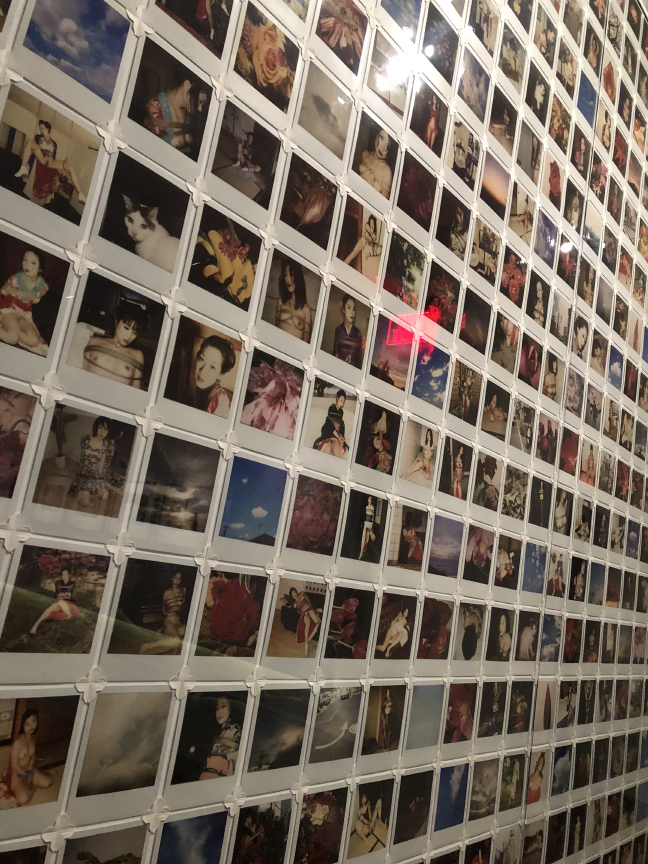
Wall of Araki Polaroids.
Logically, since it was a sex museum, the work revolved around sex. Yes, Araki is well-known (at least in his home country) for his sexually provocative images. Many people have said it's pornographic, many have said it's sexist, many have said it demeaning towards women, and many have said it does nothing but perpetuate Western stereotypes about Japanese women. I can see truth in much of these criticisms. And I am not sure I am in the position to dispute any of it.
The show itself was nicely displayed, and showed a huge amount and varied amount of work. Large format, black and white images of bound women, hung next to a wall of Polaroids (of women in suggestive poses), sitting across from a 30 foot long display case of Araki photo books and magazines (some sexually explicit, many not.) The man is nothing if not prolific.
Though labeled as a renegade, and sometimes as a pornographer, Araki is nothing if not provocative. I'm not sure where I stand on his work. At the same time, it was an opportunity to explore a body of work I might not have considered otherwise.
A small sampling of Araki publications.
Zoe Leonard at The Whitney
On a "pay what you wish" Friday evening at The Whitney Museum, I took in one last photo-related exhibit, seeing the work of Zoe Leonard. I was not familiar with this artist, except for a short article I read in the New York Times about a series of photos of storefronts that she created. So I was walking in with no expectations, and very little preconceptions. The overall exhibit was a combination of original photographs, sculpture, found imagery (including a magnificent wall of postcards from Niagara Falls) and found objects. The overarching theme seemed to be a exploration of the mass production of imagery, along with an exploration of loss and impermanence.
Niagara Falls, step by step, inch by inch.
The series of color photographs of storefronts and streets scenes of the East Village, as well as countries like Cuba and Uganda, were the most straightforward set of images in the entire exhibit. Titled "Analogue," they proved to be a nice counter to the work of Eggleston that I saw earlier in my trip. Both used the dye transfer printing process, renowned for its rich color saturation, however, Leonard's work retained a level of grit, worthy of its subject matter.
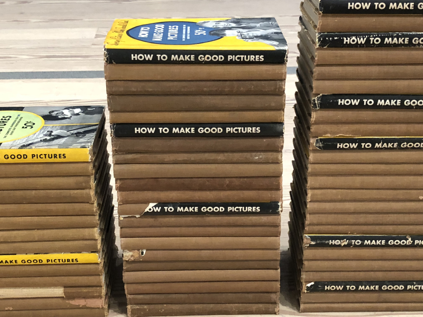
The work that I was most pleasantly surprised by, was a series of sculptural pieces, utilizing books. One piece in particular, a row of stacked Kodak instructional photo books, tracing the publishing history of a specific title "How To Make Good Pictures" was a clever rumination on not only the passage of time, but also about the advances of image making technology, and the need to understand it.
Zoe Leonard at The Whitney.
Though there is no shortage of photography available online or at a bookshop, sometimes it's really important to wander through a gallery or museum, and see the work up close and personal. I'm grateful that I have the ways and means to be have been able to see so much great photography during my travels. I find it motivating and inspiring.
City of Ghosts & Dreams
I am excited to share a new body of work on my website today. The series is a bit of a departure for me, in that it is all color photography. The pairing of the images are the result of a kind of visual improvisation, both in my approach to how I shot, as well as how I created the resulting diptychs. Everything was shot with one camera and one lens, during an extended stay in New York during the Spring of 2017. The shift of political and social winds could be felt as I roamed the streets, though I tried (but failed) to not make any overt political statements with the images. I guess the personal is political, as they say. This series will be the subject of a new book I will be releasing in the very near future. I hope you enjoy.
New York City Reflections
Just returned from a week in The Big Apple. A place I know so well, and yet I am always surprised by when I return for a visit. I shot with one camera, and one lens for the entire week, and I am super excited by the results. A new zine or book project feels imminent. Stay tuned.


